
Identify and describe types of reusable components including canvas component libraries and Power Apps Component Framework (PCF) components
Developers working from a blank canvas can create components that define the characteristics of the app’s screen elements. A component can be a form, a button, a text box, or any other element. It is possible to create a button or other screen element individually, but the advantage of creating it as a component is that it becomes reusable on multiple screens. Components in Power Apps function in much the same way as styles in Microsoft Word; they consist of multiple attributes that users can apply in one step.
For example, a canvas app might consist of several screens, each of which has one or more buttons on it, and the developer wants all the buttons to have the same basic appearance. By creating a component containing the button characteristics, such as shape, color, and text size, the developer can create buttons on each app screen that all look the same. If, at a later time, the developer decides to change the appearance of the buttons—by changing the text size, for example—modifying the component will cause all the buttons in the app to change at once.
When the developer is working with a canvas app, the tree view page has two tabs: Screens and Components. On the Components tab, shown in Figure 4-8, developers can create new components, such as the button shown, which will then be accessible to any screen in the app. To insert a component into an app screen, open the Insert page and expand the Custom header to see a list of the components created in the app.
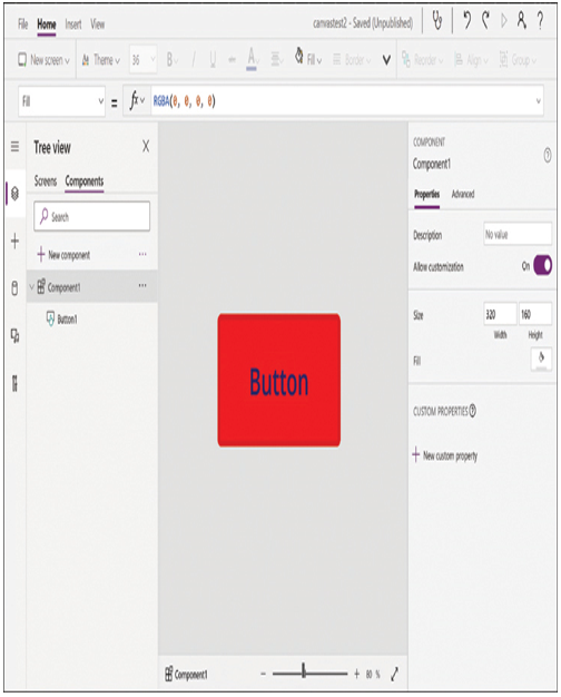
FIGURE 4-8 The Components tab in a canvas app
Component Libraries
Components by themselves simplify the process of unifying elements throughout the various screens in an app, but there are situations in which developers might want to unify elements across apps. For example, an organization might want to create multiple apps and have them all utilize the same buttons and other components. Component libraries are one way to do this. A component library is a repository for components that exists independently from the apps in which the components will be used.
In the Power Apps portal, component libraries are listed on the Apps page under the Component libraries tab, as shown in Figure 4-9. Developers can create new component libraries here and add components to them; the process of creating components in a library is virtually identical to creating them in an app. After creating them, developers can share component libraries with other users.
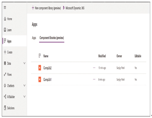
FIGURE 4-9 The Component libraries tab on the Apps page in the Power Apps portal
To access a component library when creating an app, a developer opens the Insert page and clicks the Get more components button at the bottom of the screen. This generates a list of the available component libraries, as shown in Figure 4-10, from which the developer can import individual components or the entire library.
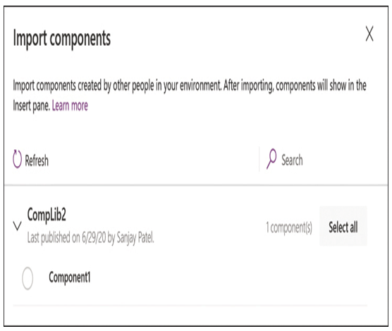
FIGURE 4-10 The Import components pop-up on the Insert page of a canvas app
After they are imported, the selected components appear under a Library components header in the Insert pane, as shown in Figure 4-11. As with components created within an app, modifying a component in a library can cause it to change in all the apps where developers have used it. To do this, however, the developer must publish the component library after making the changes and then update the apps in which the library components appear by clicking Check for updates on the Insert page.

FIGURE 4-11 The Library components header on the Insert page of a canvas app