
Use controls to design the user experience
With connections in place, the actual process of designing an app in Power Apps involves placing controls and other elements on the app screens to create a usable interface for the consumers who will be running it. The term control refers here to any of the display elements found on an app screen. The title box at the top of the screen, the buttons that trigger functions, and the panels containing data from your source are all examples of controls.
One of the best ways to learn about controls is to explore the ones created automatically when you generate an app from a data source or a template. The three screens shown earlier from the sample FlooringEstimates app are typical of an app generated from a tabular data source. These screens are as follows:
■ Gallery—The gallery screen, shown in Figure 4-28 and called BrowseScreen1 in the sample app, displays the table data from the connected source as a scrolling list, with each product box containing the data from one row in the table. The gallery control (called BrowseGallery1) is the primary control for the screen, occupying most of its real estate. The other controls listed in the Tree View pane implement the other elements on the screen, including the title bar (called a label control), the buttons on the title bar (called icon controls), and the search box (called a text input control). The BrowseGallery1 control in the Tree View pane is expandable because it contains other controls that create the contents of each box in the gallery.
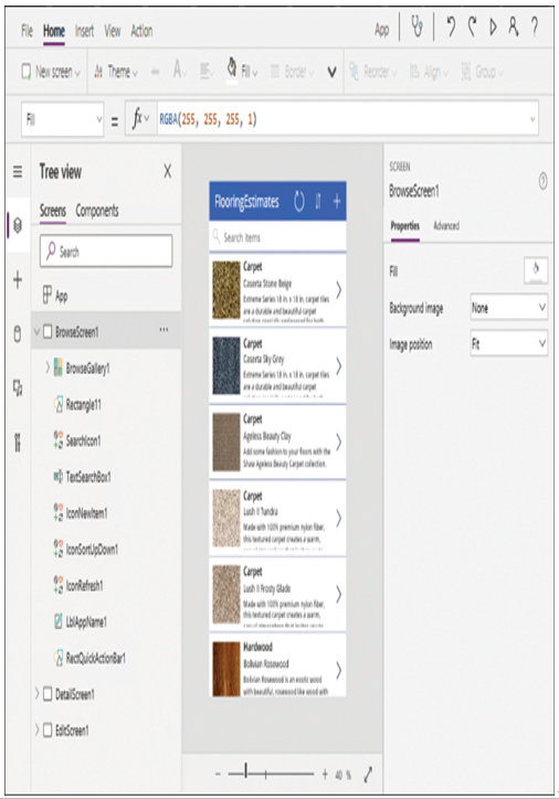
FIGURE 4-28 The BrowseScreen1 screen in a Power Apps sample app
■ Detail—The detail screen, shown in Figure 4-29 and called DetailScreen1 in the sample app, displays all the information for one product selected from the gallery. Apart from the label and icon controls in the title bar, the screen consists mostly of card controls, which contain the individual data elements corresponding to the cells in the source spreadsheet.

FIGURE 4-29 The DetailScreen1 screen in a Power Apps sample app
■ Edit—The edit screen, shown in Figure 4-30 and called EditScreen1 in the sample app, displays the same information as the detail screen, but in editable controls so that the user can modify the information. Instead of simple card controls, which only display the data, this screen uses text input controls to contain the individual data points so that the user can modify them. All of these editable controls are part of an edit form control.
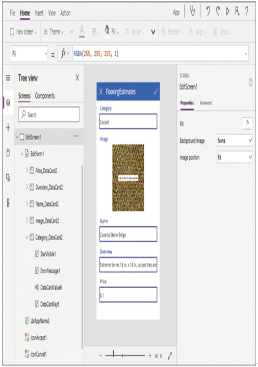
FIGURE 4-30 The Edit screen in a Power Apps sample app
When working in the Power Apps Studio portal, clicking any element in a screen highlights the corresponding control in the Tree View pane and displays the properties of the control in the right pane. All controls have properties that specify how they look and what they do. The right pane in the Studio interface contains some of the properties for the selected control, using text boxes, buttons, and drop-down lists to allow the developer to modify the property values.
An equation bar near the top of the interface contains a drop-down list for selecting a property and an interactive function box, as shown in Figure 4-31, in which the developer can work with the individual property values. In the sample, the Data Source property of the EditForm1 control on the edit screen indicates that the data comes from the spreadsheet, identified as @FlooringEstimates.

FIGURE 4-31 The equation bar from the Power Apps Studio interface
This FlooringEstimates app contains only a small sampling of the controls available to developers in Power Apps and how they can make use of them. The insert bar, above the equation bar in the figure, contains buttons and drop-down menus that allow the developer to insert controls anywhere on an app screen. The buttons and menus include the following:
■ New screen—Adds screens of various types to the bottom of the Tree View from a gallery of thumbnails, including list, form, email, and calendar formats
■ Label—Adds a text box intended for display text
■ Button—Adds a rectangular blue button that developers can resize and recolor as needed
■ Text—Adds a box for the display and/or insertion of text in various formats, including plain text, HTML, rich text, and pen input
■ Input—Adds controls that allow users to supply data, including text boxes, drop-down lists, combo boxes, date pickers, check boxes, radio buttons, and toggles
■ Media—Adds controls that allow apps to display images, audio, and video, as well as accept user input from cameras and barcode scanners
■ Charts—Adds controls that can display the source data as column, line, or pie charts, as well as insert Power BI tile
■ Icons—Adds controls that display small icons, such as plus signs, pencils, and check marks, which can function as buttons
■ Custom—Allows developers to create, import, and export components
■ AI Builder—Allows the insertion of standard AI Builder functions, such as the business card reader, the form processor, and the object detector